BOS Document Designer Interface
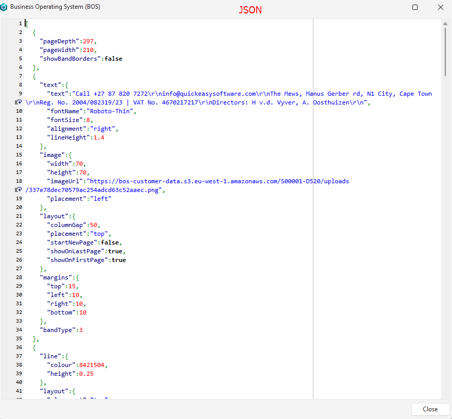
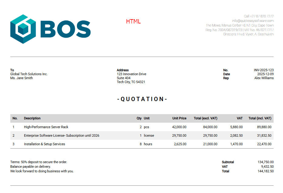
The BOS Document Designer is a flexible designer that allows organisations to create and customise their own forms such as invoices and quotations. These forms can be output in JSON, HTML or PDF. The output is generated through a separate app that runs on AWS. The desktop app creates the JSON and sends it to the Document Creator, which parses it and returns a PDF or an HTML file. If the Document Creator app is unavailable, an Invalid JSON error is returned.
The Document Designer can link to transactions or proposals.
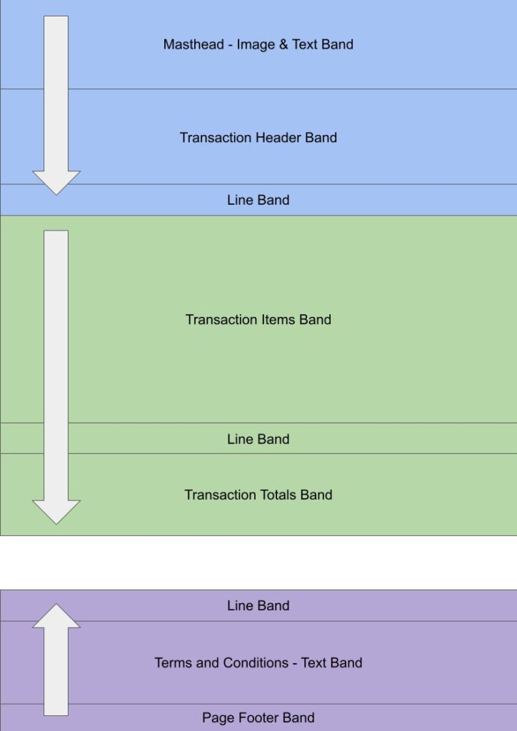
Documents are designed by stacking bands on top of each other from the top down within a group. Bands can be dragged to reorder them, or to move them to a different group. Certain bands do not work with HTML because they rely on pages (e.g. Page Footer).
Two open-source fonts are supported with three styles each:
- Roboto Light, Regular, and Bold
- Roboto Serif Light, Regular, and Bold
If the text includes Thai characters, the fonts are substituted with these fonts:
- Roboto > Noto Sans Thai
- Roboto Serif > Noto Sans Thai Looped
Navigation: Main Menu > Setup > Form Designer > BOS Document Designer
List View
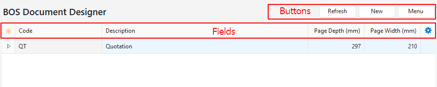
Buttons Explained
| Button | Description |
|---|---|
| Refresh | Updates the display. |
| New | Creates a new document template. |
| Menu | Layout |
Fields Explained
| Field | Description |
|---|---|
| Field Chooser (*) | Allows columns to be added or removed. |
| ID | The system-generated number allocated to the entry. |
| Library ID | The system-generated number for the online library entry. |
| Code | The brief description of the document. |
| Description | The document’s description. |
| Page Depth (mm) | The length of the page in mm. |
| Page Width (mm) | The width of the page in mm. |
| Created | The date on which the document was created. |
| Updated | The date on which the document was updated. |
| Updated By | The user who last updated the document. |
| Widget | A submenu with the following options: – Edit – Copy – Delete Ctrl+Del |
Edit View
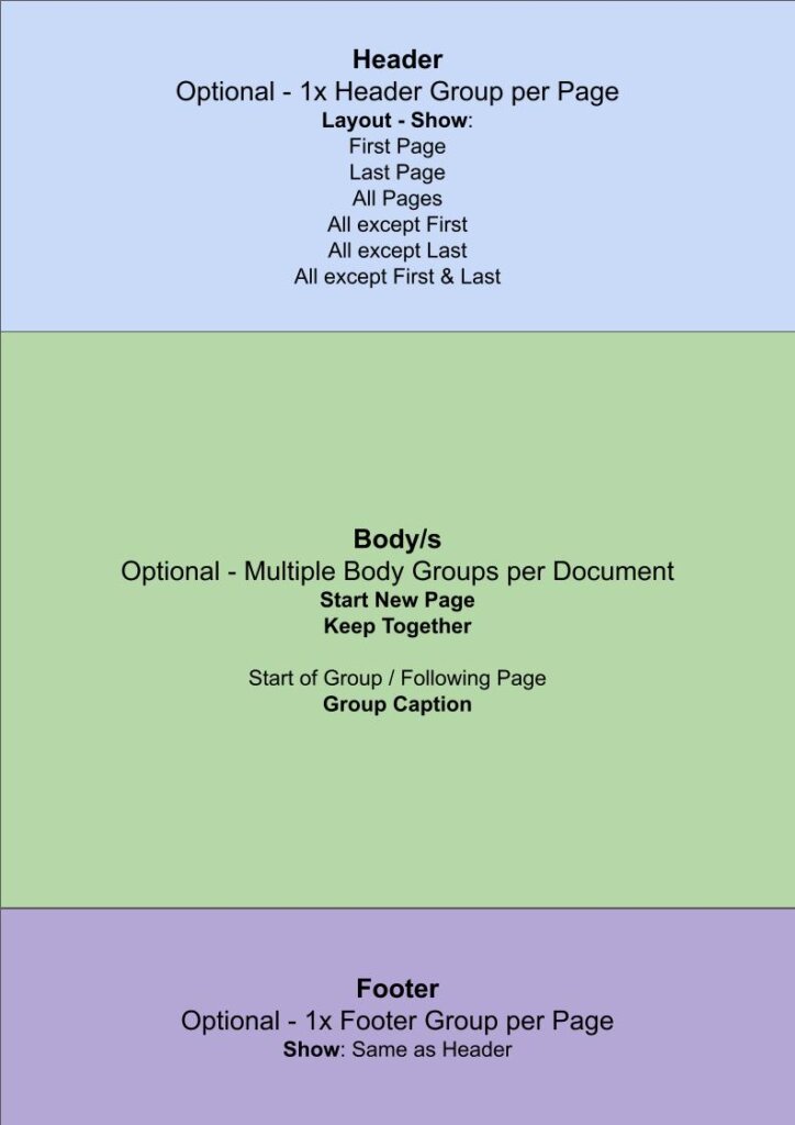
- The document can be divided into three groups:
- Header: Fields in this group are displayed at the top of a page. There can only be one header per page, but pages can have different headers.
- Body: Fields in this group are displayed between the headers and footers. A document can have multiple body groups.
- Footer: Fields in this group are displayed at the bottom of a page. There can only be one footer per page, but pages can have different footers.
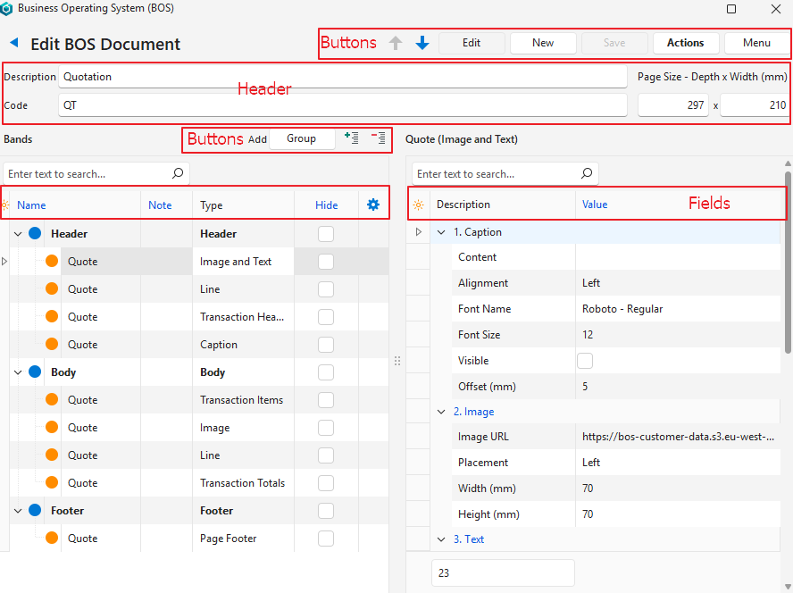
Buttons Explained: Top Row
| Button | Description |
|---|---|
| Arrows | Navigates between documents. |
| Edit | Allows the entries to be edited. |
| New | Creates a new document. |
| Save | Saves any changes. |
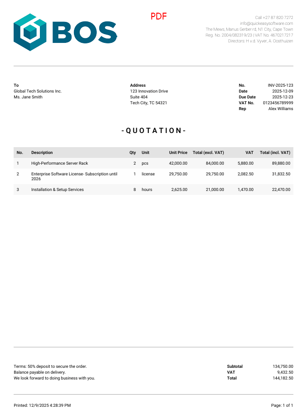
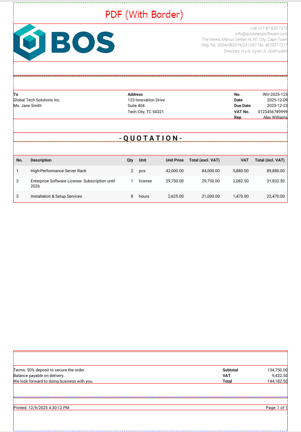
| Actions | Copy Template: Copies the template to create a new one. Delete Template: Deletes the template. Reset Sort Order: Organises the groups’ sort orders. Preview – JSON: Displays a JSON preview. – HTML: Displays an HTML preview. – PDF: Displays a PDF preview. – PDF (With Border): Displays a PDF preview and draws lines to include the various fields’ borders. |
| Menu | Layout |
Header Explained
| Field | Description |
|---|---|
| Description | Type a name for the document. |
| Code | Type a brief description for the document. |
| Page Size – Depth (mm) | Type the depth (length) of the page. |
| Page Size – Width (mm) | Type the width of the page. |
Bands Fields and Buttons Explained
| Field | Description |
|---|---|
| Group (button next to Add) | Adds a new Group as selected from this list: – Header – Body – Footer |
| + – (buttons) | Collapses or expands the groups. |
| Field Chooser (*) | Allows columns to be added or removed. |
| ID | The system-generated number for the entry. |
| Parent ID | The system-generated number for the entry’s group. |
| Order ID | The system-generated number for the order of the entry within the group. |
| Key ID | The system-generated number for the entry (same as the ID field). Applies when a document is copied. The Key ID is retained and linked to the Parent ID, which retains the embedding structure (i.e. tree view). |
| Name | A field to enter a name for the band. Multiple bands can be given the same name to form a group. Groups are used in proposals to link the bands to proposal items. |
| Note | A field to enter a note (optional). |
| Type | The type of the band that was added. |
| Hide | Checkbox. An option to hide the information for testing purposes. |
| Widget | A submenu with the following options: – Add Band > – Caption – Group Caption – Image – Text – Image and Text – Attributes – Page Footer – Line – Transaction Header – Transaction Items – Transaction Totals – Copy – Delete |
Band and Group Fields Explained
Common Fields
| Field | Description |
|---|---|
| Field Chooser (*) | Allows columns to be added or removed. |
| ID | The system-generated number for the entry. |
| Description | The names of the fields that must be completed. The descriptions are divided into blocks which change depending on the selected band. (See below.) |
| Value | The values that must be typed in, checked, or selected. |
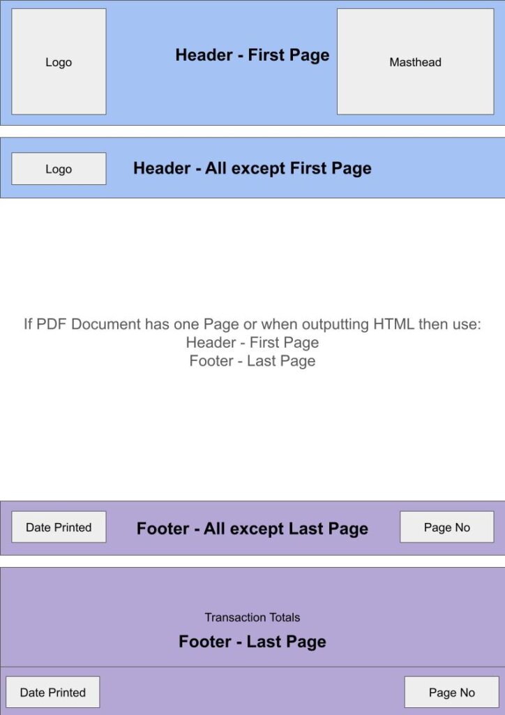
Group Options: Header
- Fields in this group are displayed at the top of a page.
- There can only be one header per page, but pages can have different headers.
- If there is only one page, the first page header is displayed.
| Field | Description |
|---|---|
| 1. Layout | |
| Show | Select an option from this list: – All Pages – First Page – Last Page – All excluding First Page – All excluding Last Page – All excluding First and Last Page |
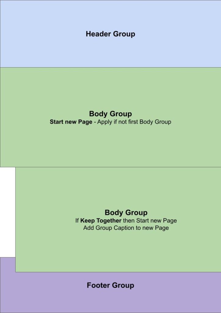
Group Options: Body
Fields in this group are displayed between the headers and footers. A document can have multiple body groups.
| Field | Description |
|---|---|
| 1. Layout | |
| Start New Page | Checkbox. If checked, a new page is started. |
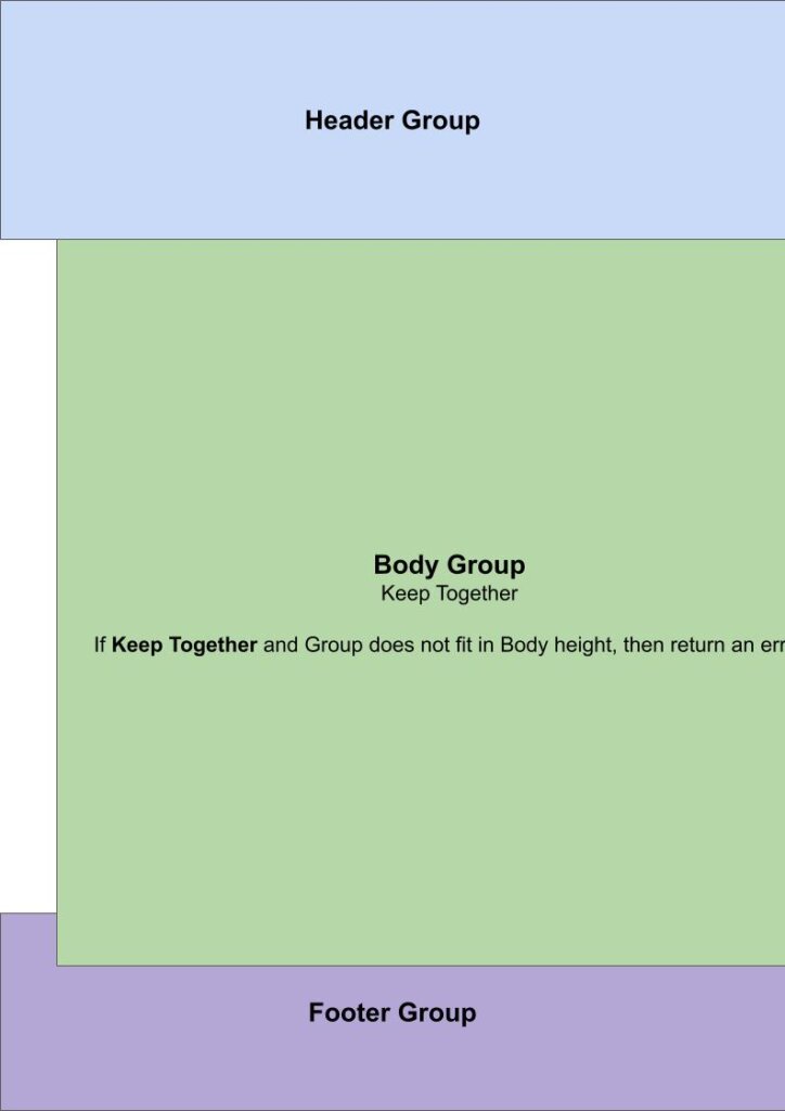
| Keep Together | Checkbox. If checked, the context will be kept together. |
Group Options: Footer
- Fields in this group are displayed at the bottom of a Page.
- There can only be one footer per page, but pages can have different footers.
- If there is only one page, the last page footer is displayed.
| Field | Description |
|---|---|
| 1. Layout | |
| Show | Select an option from this list: – All Pages – First Page – Last Page – All excluding First Page – All excluding Last Page – All excluding First and Last Page |
Band Options: Caption
The caption field is used for a large heading (e.g. QUOTATION) but can also be modified to include a field from the transaction (e.g. the reference field).
| Field | Description |
|---|---|
| 1. Caption | |
| Content | Click the pencil to open a notepad where text can be entered. A list of data fields is also displayed which can be incorporated (e.g. Quotation for [transaction_reference] will display the reference field of the transaction next to the text ‘Quotation for ‘). |
| Alignment | Select an alignment from this list: – Left – Centre – Right |
| Font Name | Select a font from this list: – Roboto – Thin – Roboto – Regular – Roboto – Bold – Roboto Serif – Thin – Roboto Serif – Regular – Roboto Serif – Bold Examples of these fonts can be seen here. |
| Font Size | Type the font size (e.g. 14). |
| 2. Margins | |
| Top (mm) | Type a number for the top margin. |
| Bottom (mm) | Type a number for the bottom margin. |
| Left (mm) | Type a number for the left margin. |
| Right (mm) | Type a number for the right margin. |
| 3. Data Binding | |
| Test – Item (ID) | Type the system-generated number (ID) of an item for testing purposes. |
| Test – Transaction (ID) | Type the system-generated number (ID) for a transaction for testing purposes. |
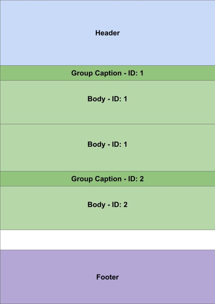
Band Options: Group Caption
The caption field is used for a group heading and is only displayed once per page.
| Field | Description |
|---|---|
| 1. Caption | |
| Content | Click the pencil to open a notepad where text can be entered. A list of data fields is also displayed which can be incorporated (e.g. Quotation for [transaction_reference] will display the reference field of the transaction next to the text ‘Quotation for ‘). |
| Alignment | Select an alignment from this list: – Left – Centre – Right |
| Font Name | Select a font from this list: – Roboto – Thin – Roboto – Regular – Roboto – Bold – Roboto Serif – Thin – Roboto Serif – Regular – Roboto Serif – Bold Examples of these fonts can be seen here. |
| Font Size | Type the font size (e.g. 14). |
| 2. Margins | |
| Top (mm) | Type a number for the top margin. |
| Bottom (mm) | Type a number for the bottom margin. |
| Left (mm) | Type a number for the left margin. |
| Right (mm) | Type a number for the right margin. |
| 3. Data Binding | |
| Test – Item (ID) | Type the system-generated number (ID) of an item for testing purposes. |
| Test – Transaction (ID) | Type the system-generated number (ID) for a transaction for testing purposes. |
Selected Band Options: Line
A horizontal line that is used to separate sections. It is for visual purposes only.
| Field | Description |
|---|---|
| 1. Line | |
| Colour | Click the colour block to display an arrow. Click the arrow to select a colour for the line. |
| Height | Type the height of the line in mm (e.g. 0.25). |
| 2. Margins | |
| Top (mm) | Type a number for the top margin. |
| Bottom (mm) | Type a number for the bottom margin. |
| Left (mm) | Type a number for the left margin. |
| Right (mm) | Type a number for the right margin. |
Selected Band Options: Transaction Header
The transaction header includes the customer or supplier’s details and other relevant information such as the name of the rep.
| Field | Description |
|---|---|
| 1. Text | |
| Label – Number | Type a label for the number field (e.g. No.). |
| Label – Date | Type a label for the date field (e.g. Date). |
| Label – Due Date | Type a label for the due date (e.g. Due Date). This field can be customised and might not be used as a due date. Check the transaction for the correct caption. |
| Label – VAT No. | Type a label for the VAT registration number (e.g. VAT No.). |
| Label – Rep | Type a label for the rep field (e.g. Rep). The field displays the rep’s code (short name). |
| Font Name | Select a font from this list: – Roboto – Thin – Roboto – Regular – Roboto – Bold – Roboto Serif – Thin – Roboto Serif – Regular – Roboto Serif – Bold |
| Font Size | Type the font size (e.g. 8). |
| Line Height (em) | Type the line height in em quadrant (e.g. 1.4). The em unit is the height of the font in nominal points or inches. |
| 3. Margins | |
| Top (mm) | Type a number for the top margin. |
| Bottom (mm) | Type a number for the bottom margin. |
| Left (mm) | Type a number for the left margin. |
| Right (mm) | Type a number for the right margin. |
Selected Band Options: Transaction Items
This band is for the details of the transaction (e.g. the line items on a quotation).
| Field | Description |
|---|---|
| 01. Column – Item No. | |
| Label | Type a label for the number field (e.g. No.). |
| Alignment | Select an alignment from this list: – Left – Centre – Right |
| Visible | Check the checkbox to display the field. |
| Width (mm) | Type the width in mm. |
| 02. Column – Description | |
| Label | Type a label for the description (e.g. Description). |
| Alignment | Select an alignment from this list: – Left – Centre – Right |
| Visible | Check the checkbox to display the field. |
| Width (mm) | Enter the width in mm. |
| 03. Column – Quantity | |
| Label | Type a caption for the quantity (e.g. Qty). |
| Alignment | Select an alignment from this list: – Left – Centre – Right |
| Visible | Check the checkbox to display the field. |
| Width (mm) | Type the width in mm. |
| 04. Column – Unit | |
| Label | Type a label for the unit (e.g. Unit). |
| Alignment | Select an alignment from this list: – Left – Centre – Right |
| Visible | Check the checkbox to display the field. |
| Width (mm) | Type the width in mm. |
| 05. Column – Unit Price | |
| Label | Type a label for the unit price (e.g. Unit Price). |
| Alignment | Select an alignment from this list: – Left – Centre – Right |
| Visible | Check the checkbox to display the field. |
| Width (mm) | Type the width in mm. |
| 06. Column – Total Exc | |
| Label | Type a label for the VAT exclusive total (e.g. Total (excl. VAT)). |
| Alignment | Select an alignment from this list: – Left – Centre – Right |
| Visible | Check the checkbox to display the field. |
| Width (mm) | Type the width in mm. |
| 07. Column – VAT | |
| Label | Type a label for the VAT amount (e.g. VAT). |
| Alignment | Select an alignment from this list: – Left – Centre – Right |
| Visible | Check the checkbox to display the field. |
| Width (mm) | Type the width in mm. |
| 08. Column – Total Inc | |
| Label | Type a label for the unit price (e.g. Unit Price). |
| Alignment | Select an alignment from this list: – Left – Centre – Right |
| Visible | Check the checkbox to display the field. |
| Width (mm) | Type the width in mm. |
| 09. Text | |
| Font Name | Select a font from this list: – Roboto – Thin – Roboto – Regular – Roboto – Bold – Roboto Serif – Thin – Roboto Serif – Regular – Roboto Serif – Bold |
| Font Size | Type the font size (e.g. 8). |
| 10. Margins | |
| Top (mm) | Type a number for the top margin. |
| Bottom (mm) | Type a number for the bottom margin. |
| Left (mm) | Type a number for the left margin. |
| Right (mm) | Type a number for the right margin. |
Selected Band Options: Transaction Totals
This section is for the totals (sum of all the transaction item totals).
| Field | Description |
|---|---|
| 1. Column – Left | |
| Text | Click the field then click the pencil to open a notepad where text can be entered. |
| Width (mm) | Type the width for the field in mm. |
| 2. Column – Centre | |
| Text | Click the field then click the pencil to open a notepad where text can be entered. |
| 3. Column – Right | Type the font size (e.g. 8). |
| Label – Subtotal | Type a label for the subtotal (e.g. Subtotal). |
| Label – VAT | Type a label for the VAT amount (e.g. VAT). |
| Label – Total | Type a label for the total (e.g. Total). |
| Width (mm) | Type the width for the entry in mm. |
| Label Width (mm) | Type the width for the label in mm. |
| 4. Text | |
| Font Name | Select a font from this dropdown list: – Roboto – Thin – Roboto – Regular – Roboto – Bold – Roboto Serif – Thin – Roboto Serif – Regular – Roboto Serif – Bold |
| Font Size | Type the font size (e.g. 8). |
| Line Height (em) | Type the line height in em quadrant (e.g. 1.4). |
| 5. Margins | |
| Top (mm) | Type a number for the top margin. |
| Bottom (mm) | Type a number for the bottom margin. |
| Left (mm) | Type a number for the left margin. |
| Right (mm) | Type a number for the right margin. |
Selected Band Options: Page Footer
This section is for information to place in the footer such as the date printed.
| Field | Description |
|---|---|
| 1. Column – Left | |
| Left | Select what data should be displayed from this list: – Page Set – Date Printed – Custom Text |
| Custom Text | Type the custom text if that option was selected in the previous line. |
| 2. Column – Centre | |
| Centre | Select what data should be displayed from this list: – Page Set – Date Printed – Custom Text |
| Custom Text | Type the custom text if that option was selected. |
| 3. Column – Right | |
| Right | Select what data should be displayed from this list: – Page Set – Date Printed – Custom Text |
| Custom Text | Type the custom text if that option was selected. |
| 4. Text | |
| Font Name | Select a font from this list: – Roboto – Thin – Roboto – Regular – Roboto – Bold – Roboto Serif – Thin – Roboto Serif – Regular – Roboto Serif – Bold |
| Font Size | Type the font size (e.g. 8). |
| 5. Margins | |
| Top (mm) | Type a number for the top margin. |
| Bottom (mm) | Type a number for the bottom margin. |
| Left (mm) | Type a number for the left margin. |
| Right (mm) | Type a number for the right margin. |
Selected Band Options: Image
Caption: By default, the Item Description is displayed. However, Data Fields can be used to customise the caption.
| Field | Description |
|---|---|
| 1. Caption | |
| Content | Type a description for the field. If left blank and an attachment is named in the Data Binding section, displays the Attachment’s Description. |
| Placement | Select a placement from this list: – Top – Bottom |
| Font Name | Select a font from this list: – Roboto – Thin – Roboto – Regular – Roboto – Bold – Roboto Serif – Thin – Roboto Serif – Regular – Roboto Serif – Bold |
| Font Size | Type the font size (e.g. 8). |
| Visible | Check the checkbox to display the caption. Uncheck the checkbox to hide the caption. |
| Offset (mm) | Type an offset (indent) amount for the caption. |
| 2. Image | |
| Image URL | Type or paste an URL. |
| Placement | Select a placement from this list: – Left – Centre – Right |
| Width (mm) | Type the image width in mm. |
| Height (mm) | Type the image height in mm. |
| 3. Margins | |
| Top (mm) | Type a number for the top margin. |
| Bottom (mm) | Type a number for the bottom margin. |
| Left (mm) | Type a number for the left margin. |
| Right (mm) | Type a number for the right margin. |
| 4. Data Binding | |
| Test – Item (ID) | Type an item’s system-generated number (ID) for testing purposes. |
| Attachment (Name) | A dropdown list of preconfigured attachment names to select one. If the attachment has a custom name, it can be entered manually instead of selecting one from the dropdown list. |
Selected Band Options: Text
This band allows text to be included.
| Field | Description |
|---|---|
| 1. Caption | |
| Content | Type a caption for the field. It left blank and a note is selected in the Data Binding section then the note’s Reference is displayed. |
| Alignment | Select an alignment from this list: – Left – Centre – Right |
| Font Name | Select the font from this list: – Roboto – Thin – Roboto – Regular – Roboto – Bold – Roboto Serif – Thin – Roboto Serif – Regular – Roboto Serif – Bold |
| Font Size | Type the font size (e.g. 8). |
| Visible | Check the checkbox to display the caption. Uncheck the checkbox to hide it. |
| Offset (mm) | Type an offset (indent) amount for the caption. |
| 2. Text | |
| Content | Click the pencil to type or paste the text in a text editor. |
| Alignment | Select the alignment for the text form this list: – Left – Centre – Right – Justify |
| Font Name | Select the font from this list: – Roboto – Thin – Roboto – Regular – Roboto – Bold – Roboto Serif – Thin – Roboto Serif – Regular – Roboto Serif – Bold |
| Font Size | Type the font size (e.g. 8). |
| Line Height (em) | Type the line height in em. |
| 3. Layout | |
| Columns | Type the number of columns. |
| Column Gap | Type a number for the space between columns. |
| 4. Margins | |
| Top (mm) | Type a number for the top margin. |
| Bottom (mm) | Type a number for the bottom margin. |
| Left (mm) | Type a number for the left margin. |
| Right (mm) | Type a number for the right margin. |
| 5. Data Binding | |
| Test – Item (ID) | Type the system-generated number (ID) of an item for testing purposes. |
| Test – Transaction (ID) | Type the system-generated number (ID) of a transaction for testing purposes. |
| Note (Name) | Select a preconfigured name of a note. The body of the note is displayed. If the note has a custom name, it can be entered manually instead of selecting one from the dropdown list. |
Selected Band Options: Image and Text
This band can be used to insert a header such as the company name and logo.
| Field | Description |
|---|---|
| 1. Caption | |
| Content | Type a caption for the text portion of the entry. It left blank and a note is selected in the Data Binding section then the note’s Reference is displayed. |
| Alignment | Select the caption’s alignment from this list: – Left – Centre – Right |
| Font Name | Select the font from this list: – Roboto – Thin – Roboto – Regular – Roboto – Bold – Roboto Serif – Thin – Roboto Serif – Regular – Roboto Serif – Bold |
| Font Size | Type the font size (e.g. 8). |
| Visible | Check the checkbox to display the caption. Uncheck the checkbox to hide it. |
| Offset (mm) | Type an offset (indent) amount for the caption. |
| 2. Image | |
| Image URL | Type or paste an URL. |
| Placement | Select a placement from this list: – Left – Right |
| Width (mm) | Type the image width in mm. |
| Height (mm) | Type the image height in mm. |
| 3. Text | |
| Content | Click the pencil to type or paste the text using a text editor. |
| Alignment | Select the text’s alignment form this list: – Left – Centre – Right – Justify |
| Font Name | Select the font from this list: – Roboto – Thin – Roboto – Regular – Roboto – Bold – Roboto Serif – Thin – Roboto Serif – Regular – Roboto Serif – Bold |
| Font Size | Type the font size (e.g. 8). |
| Line Height (em) | Type the line height in em (e.g. 1.4). |
| 4. Layout | |
| Column Gap | Type a number for the space between columns. |
| 5. Margins | |
| Top (mm) | Type a number for the top margin. |
| Bottom (mm) | Type a number for the bottom margin. |
| Left (mm) | Type a number for the left margin. |
| Right (mm) | Type a number for the right margin. |
| 6. Data Binding | |
| Test – Item (ID) | Type the system-generated number (ID) of an item used to test the template. |
| Attachment (Name) | A dropdown list of preconfigured attachment names. If the attachment has a custom name, it can be entered manually instead of selecting one from the dropdown list. |
| Note (Name) | A dropdown list of preconfigured note names. If the note has a custom name, it can be entered manually instead of selecting one from the dropdown list. |
Attributes
| Field | Description |
|---|---|
| 1. Caption | |
| Content | Type a name for the field. If left blank displays the Attribute Group’s caption. |
| Alignment | Select the text’s alignment form this list: – Left – Centre – Right |
| Font Name | Select the font from this list: – Roboto – Thin – Roboto – Regular – Roboto – Bold – Roboto Serif – Thin – Roboto Serif – Regular – Roboto Serif – Bold |
| Font Size | Type the font size (e.g. 8). |
| Visible | Check the checkbox to display the caption. Uncheck the checkbox to hide it. |
| Offset (mm) | Type a number to indent the caption in mm (e.g. 5). |
| 2. Text | |
| Font Name | Select the font from this list: – Roboto – Thin – Roboto – Regular – Roboto – Bold – Roboto Serif – Thin – Roboto Serif – Regular – Roboto Serif – Bold |
| Font Size | Type the font size (e.g. 8). |
| Label Width (mm) | Type the label width (e.g. 80). |
| 3. Margins | |
| Top (mm) | Type a number for the top margin. |
| Bottom (mm) | Type a number for the bottom margin. |
| Left (mm) | Type a number for the left margin. |
| Right (mm) | Type a number for the right margin. |
| 4. Data Binding | |
| Test – Item (ID) | Type the system-generated number (ID) of an item for testing purposes. |
| Attributes (Name) | Type the name of an attribute group. |
Preview Examples
Examples of Using Groups
Learn More
- BOS Document Designer Tutorials: Tutorials explaining how to create an output document (e.g. quotations and invoices).
- Email Edit View: Explains the interface from which emails can be created.
- Email List View: Explains the interface that lists all the emails that have been created.
- Email Templates: Explains the interface from which email templates can be created. Lists all the available data fields.
- Form Designer – Reportbuilder Tutorials: These tutorials explain how to create or edit a template (form).
- Form Designer Interface: Explains the commonly used features for the Form Designer.
- Output Button: Explains the Output button that is available on most views.
- Output Template Tutorials: These tutorials explain how to add templates to transaction types and other modules.
- Output Templates Module: Explains the Output Templates interface.