Form Designer Interface
- QuickEasy BOS has a built-in form designer that allows users to customise all their templates (e.g. statements, invoices, emails.)
- Users have access to the Data Tables and Fields, as well as editing tools to help them design forms.
- Forms may be designed from scratch or copied from an existing template and edited.
- There is also a form wizard that guides users to create their own forms (accessed from File > New > Report Wizard).
- The explanations below describe the main functionality of the Form Designer. It does not describe every function in detail.
Navigation: Main Menu > Setup > Form Designer
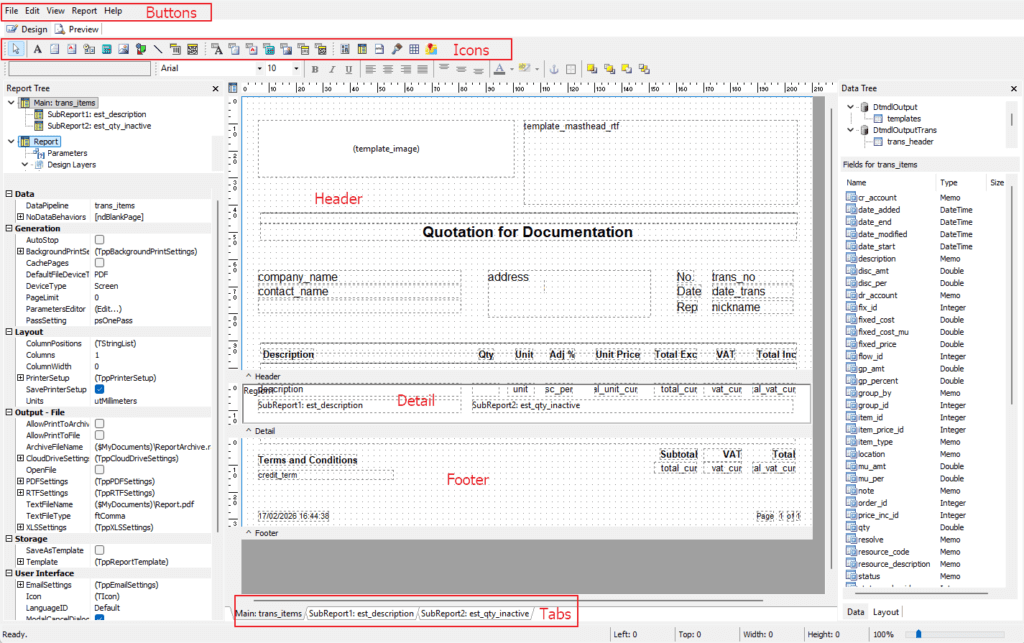
Buttons Explained
- Form Designer is a Report Builder created by Digital Metaphors Corporation.
- It is a plugin provided by QuickEasy BOS. Therefore, commands like View and Edit will not function like they normally do in QuickEasy BOS, instead they function as they would in Windows.
- Most of the menu commands are displayed as icons around the workspace. They can also be accessed via context menus (right-click).
| Button | Description |
|---|---|
| File | – New: Creates a new template. – New Report: Creates a new report. – Open…: Opens an existing template. – Close: Closes the current template. – Save: Saves your progress. WARNING: There are no prompts to save, or that you have unsaved data. Please save your work often. – Save As…: Allows users to specify a file name and save location for a template. – Load from File…: Allows users to select a file and loads it. – Save to File…: Saves the template to a file specified by the user in .rtm format. – Page Setup…: Allows users to specify the page parameters (e.g. A4, letter format). – Print: Prints the current template to the default printer. – Print to File Setup…: Exports the template to the specifications provided on the popup. |
| Edit | The following standard Windows options: – Undo – Redo – Cut – Copy – Paste – Delete – Select All Tools to reorder overlapping fields: – Bring to Front: Moves the field in front of all the other fields. – Bring Forward: Moves the field one step forwards. – Send to Back: Moves the field behind all the other fields. – Send Backward: Moves the field one step backwards. |
| View | Toolbars: Toggles showing or hiding the following toolbars: – Advanced Components – Standard Components – Data Components – Report Tree – Data Tree (Displays a list of BOS data tables and files on the right.) – Align or Space -Size – Nudge – Draw – Edit – Standard – Format Rulers: Toggles showing or hiding the rulers. Margins: Toggles showing or hiding the margins. Design Guides: Toggles showing or hiding the design guides. Grid Options: Sets the spacing, display and snapping options for the grid. Show Data: Toggles showing or hiding data. Themes: Allows users to select a different theme (layout and colour) from a dropdown list of available themes. |
| Report | Data: Pops up a list of data pipelines used in the template. Title: Provides for a title at the top of the template. Summary: Provides for a summary at the bottom of the template. Header: Toggles showing or hiding the header. Footer: Toggles showing or hiding the footer. Page Summary: Toggles showing or hiding a page summary. Page Style: Toggles showing or hiding the page style sheet. Groups: Provides an interface to group data fields together. Outline Settings: Provides a way to link certain fields. Find Text Settings: Includes a text search function. Portrait: Changes the orientation of the template to portrait. Landscape: Changes the orientation of the template to landscape. Cache Pages: Toggles caching the pages. Pass Setting: Select the number of data passes: – One Pass – Two Pass Units: Option to select one of these units for the design of the template: – Inches – Millimetres – Printer Pixels – Screen Pixels – Thousandths of MM |
| Help | Help Topics: Unavailable. About: Information about ReportBuilder. |
Tabs Explained
| Tab | Description |
|---|---|
| Design | The main interface to design a new template. |
| Preview | Allows users to preview what the report will look like. For the preview to be accurate, there must be data to preview (i.e. transactions in BOS). |
Form Sections Explained
| Form Section | Description |
|---|---|
| Header | The header section typically contains the following fields: – Company Logo – Company Address – Name of the Form / Report – Address of the recipient – Document Number – Document Date – Rep – Headings for the report detail |
| Detail | This section includes the item details (e.g. Description, Quantity, Unit Price, Total Price). |
| Footer | This section typically contains the following fields: – Terms and Conditions – A courtesy note (e.g. Thank you for your business) – Bank Details – Subtotals – VAT or GST totals – Total – Copyright information |
Icons Explained
The icons below are in order of appearance. The names (as used in this table) are displayed when the mouse is held over the icon images.
| Icon | Description |
|---|---|
| Select Object | Allows users to click objects to select them. |
| Label | Inserts a label: Click the Label (icon). Click the form to place it where you clicked (click and drag to reposition it). Double click the label and type in the label or type it in the field that will appear top right below the icons. Use the commands on the format toolbar (e.g. Font, Size, Bold, Italics, Underline) to format the label. Resize the field using the dots. |
| Memo | Inserts a memo field for several lines of text. |
| RichText | Inserts a rich text field for users to type in information with different fonts and sizes. |
| SystemVariable | Inserts system variables such as date, time, and page numbers. Click the SystemVariable (icon). Click the form to place it where you clicked (click and drag to reposition it). The word Date will appear below the icons (top right). Click the arrow next to it to select a different variable. Resize the field using the dots. |
| Variable | Inserts a variable. Used if you need to perform a calculation. |
| Image | Inserts an image. |
| Shape | Inserts a shape. |
| Line | Inserts a line. |
| Barcode | Inserts a barcode. |
| 2DBarcode | Inserts a 2D barcode |
| DBText | Inserts a database text field. |
| DBMemo | Inserts a database memo field. |
| DBRichText | Inserts a database rich text field. |
| DBCalc | Inserts a database calculation. |
| DBImage | Inserts a database image. |
| DBBarcode | Inserts a database barcode. |
| DB2DBarcode | Inserts a database 2D barcode. |
| Region | Inserts a region: – Click the Region (icon). – Click the form to place it where you clicked (click and drag to reposition it). – Resize the block using the dots to fill the space as needed. |
| Subreport | Inserts a sub-report: – Click the Subreport (icon). – Click the form to place it where you clicked (click and drag to reposition it). – Resize the block using the dots. |
| PageBreak | Inserts a page break. |
| PaintBrush | Inserts a paintbox field. |
| TableGrid | Inserts a table in grid format. |
| GoogleMap | Inserts a Google Map. |