Notes and Attachments Panel
- Notes and Attachments can be linked to all of the core modules such as Contacts, Entities, Items, and Transactions.
- When opened from a linked document, the interface can only be displayed on the right.
- Attachments can also be viewed and managed from the Attachments Module.
Navigation Example: Main Menu > Setup > Contacts > Right-click a contact > Click View/Edit Notes & Attachments
Notes and Attachments Panel
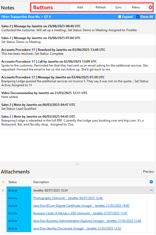
Buttons Explained
| Button | Description |
|---|---|
| Add | Adds either a Note or Attachment as selected from the dropdown list. |
| Refresh | Refreshes the display to include any newly created Notes or Attachments. |
| Sync | Synchronises the display of notes on the right with the record opened on the left. |
| Menu | Layout |
| Close (x) | Closes the Notes and Attachments popup. |
Filters Explained
| Filter | Description |
|---|---|
| Expand (Notes) | By default, a preview of the Note is displayed by removing line breaks and truncating the text to 255 characters. The Expand (checkbox), if checked, displays the entire Note. |
| Show All | Applies to transactions. If unchecked, it only shows notes for the transaction. If checked shows all the notes for the Customer or Supplier. |
| Preview (Attachments) | Checkbox. If checked, generates a preview of Attachments that are images only, instead of listing the attachments. |
Fields Explained
| Section | Information |
|---|---|
| Notes | The Module and Number of the note. The User who created the note. The Date and Time that the note was created. The note or a truncated version of the note (if Expand is unchecked). There is a right-click context menu to Edit or Delete the note. |
| Attachments (Preview unchecked) | Field Chooser (*): Allows users to add or remove columns. Status: The status of the attachment. Name: The system-generated name for the attachment. Description: The hyperlinked description, type of attachment, user, and date created. Issued: The date selected as the issued date. Expires: The date selected as the expiry date. Menu (…): A submenu to: – Copy Link: Copies the attachment link to the user’s clipboard. – Edit: Opens the attachment for editing. – Delete: Deletes the attachment. |
| Attachments (Preview checked) | Displays a preview of attachments that are Images only. |
Notes: Edit View
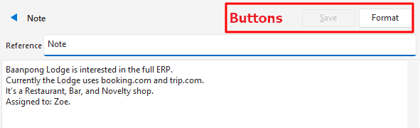
Buttons Explained
| Button | Description |
|---|---|
| Save | Saves any changes to the Note. Closes the Note. |
| Format | Removes extra line breaks. |
Fields Explained
| Field | Description |
|---|---|
| Reference | A field to type a reference or caption for the note. |
| Notepad | A plain text notepad to type or paste a note. |
Attachments: Edit View
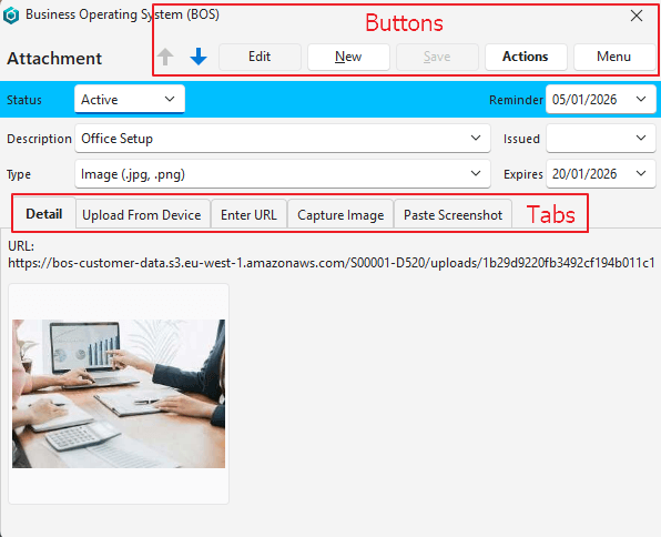
Buttons Explained
| Button | Description |
|---|---|
| ↑↓ | Navigates between Attachments. |
| Edit | Allows users to edit the Attachments. |
| New | Creates a new Attachment. |
| Save | Saves any editing changes and closes the Edit Popup (uploads are automatically saved.) |
| Actions | Copy Link: Copies the link to the user’s clipboard. Open File: Opens the file in a browser window. Delete: Deletes the attachment. |
| Menu | Edit Description Lookup Lists: Option to edit the lookup lists that can be used instead of typing a description. |
Fields Explained
| Field | Description |
|---|---|
| Status | A dropdown list for users to select Pending, Active, or Expired as the attachment’s Status. The default is Active. |
| Reminder | A calendar to select a Reminder Date (e.g. to remind you of an expiry date, or some other related event). |
| Description | If a lookup list is created, a Description can be selected. Else a Description can be typed. |
| Type | A dropdown list for users to select the type of attachment. The options are: – Document (.pdf) – File – Link – Image (.jpg, .png) – Image (Default) – Signature (Start) – Signature (Stop) |
| Issued | A calendar for users to select an Issue Date (e.g. if you upload a certificate, and you want to record the date on which the certificate was issued.) |
| Expires | A calendar for users to select an Expiry Date (e.g. if a membership expires). |
| Tabs Explained – You can only use one of the tabs below per attachment. (You can either upload files, paste a URL, or capture an image.) | |
| Detail | Displays the URL and a preview if it is an image file. |
| Upload From Device | An option to drag a file or multiple files to be uploaded. There is a General Setting that limits the size of files that can be uploaded this way. The default is 50 KB. The Select files (button) is available to navigate to the file that must be uploaded. Warning: Files uploaded as attachments count towards your storage limit. |
| Enter URL | If a file is uploaded, the URL of the uploaded file, along with its name is displayed. Alternatively, users can paste or type a URL in this field. In this case, the file is not uploaded and does not affect your storage allocation on QuickEasy’s server. |
| Capture Image | Uses a connected camera to capture what is in front of the camera. Switch (button): Switches to a different camera if more than one camera is attached (e.g. if your PC is connected to your mobile phone, you can switch between your PC and mobile camera). Pause (button): Applicable if a video is being captured. Will pause the process. Settings (button) on camera image: – A dropdown list of attached devices for users to select one. – A dropdown list of supported resolutions for users to select one. Zoom: Move the slider to reduce or enlarge the image. |
| Paste Screenshot | Allows any image on the user’s clipboard to be pasted using Ctrl V or right clicking inside the tab and clicking Paste on the context menu. |